커뮤니티

포인트
로딩중
쿠폰
내 강의실
국비 신청 내역
수강권
증명서
숙제 피드백
계정
로그아웃
학습 질문
개발 일지
나의 활동
답변 완료
이미지를 창 크기에 맞춰 가운데 정렬하기
웹개발 종합반
1주차


김*영
댓글
4
・
추천
0
・
조회수
28
조회수
28
답변 완료
화면 가로 길이가 줄어들었을 때에도 똑같이 가운데에 정렬 되도록 하고 싶습니다.
전체 화면인 경우의 스샷 입니다.

창의 가로 길이가 줄어들었을 때의 스샷 입니다.
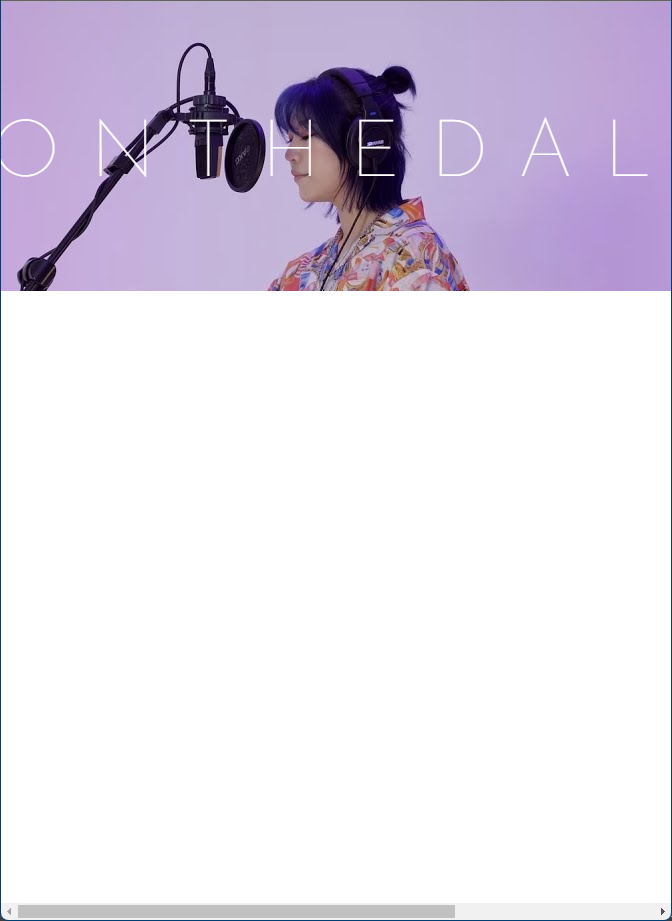

위처럼 가로 스크롤을 움직여 보면 가운데에 정렬 되어 있지 않고,
일부가 잘린 채로 좌측에 정렬되어 있는 것을 알 수 있습니다.
어떻게 해야 좋을까요!!! 구글링을 몇 시간을 했는데 잘 모르겠습니다..
아래에 코드 붙여 놓겠습니다.
< html >
 <div class="grand-container">
        <div class="text-box">
            <span>ONTHEDAL</span>
        </div>
        <div class="img-box">
            <img class="img" src="https://i.ytimg.com/vi/jzWqRF5e3CM/maxresdefault.jpg">
        </div>
    </div>
< css >
.grand-container {
    width: 100%;
    height: auto;
    margin-bottom: 100px;

    background: radial-gradient( at 50% 100%, RGB(196, 182, 217), #b193cf, #8477a1 );
    background-position: center;
    background-size: cover;
    display: flex;

    flex-direction: column;
    align-items: center;
    justify-content: center;
    position: center;
}

.text-box {
    margin-top: 20px;
    text-align: center;
    position: absolute;
    color: white;
    font-size: 80px;
    letter-spacing: 30px;
}

.img-box {
  overflow: hidden;
  max-height: 290px;
}

.img {
  max-height: initial;
  margin: -1px;
}
댓글 알림
